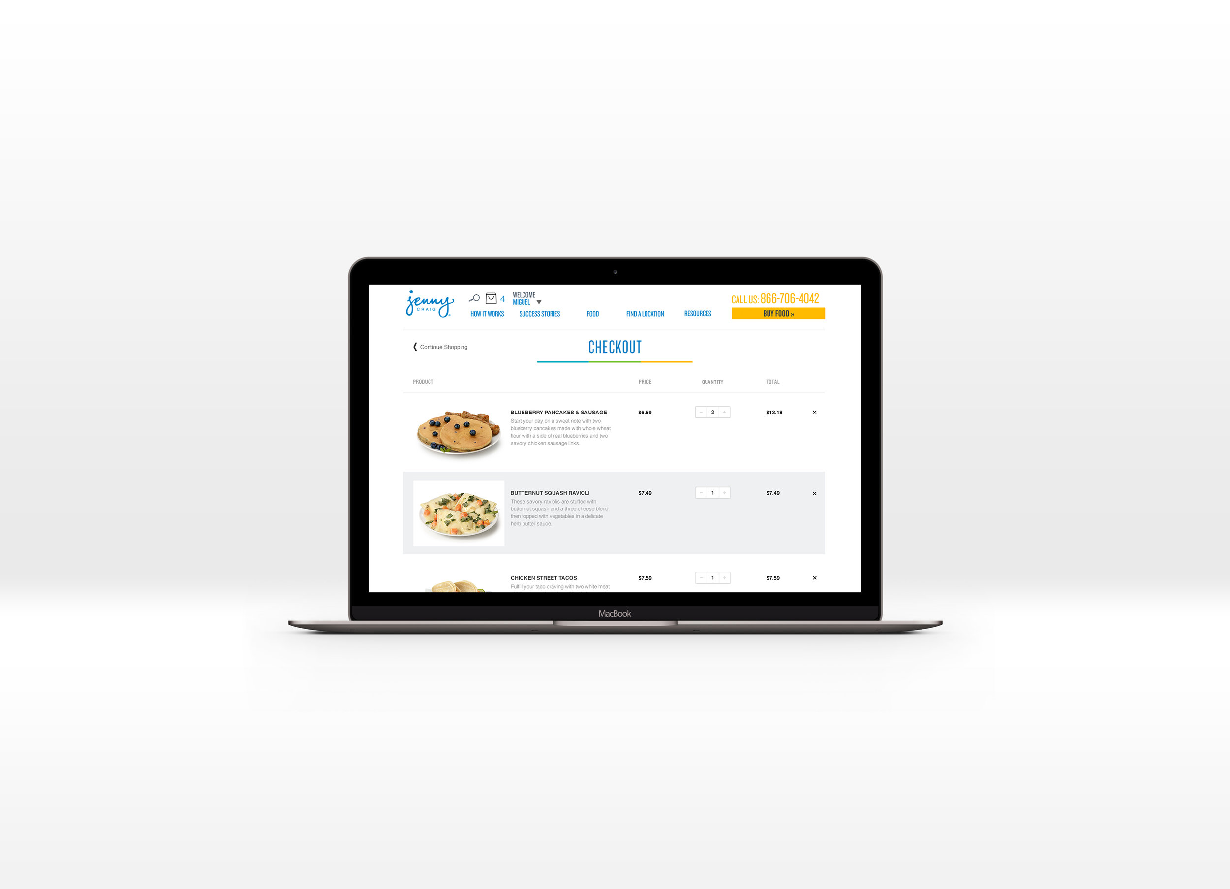
Jenny Craig Website checkout redesign UX
The following is a redesign of the Jenny Craig eCommerce checkout process for their products online. This project was undertaken because of a replatforming for their the companies eCommerce system. Because of that, the design and development teams needed to develop an entirely new checkout process. I was tasked with redesigning the new checkout process, for both mobile and desktop. The following is the desktop presentation with links below for the user experience for both mobile and desktop.
This redesign was conducted while working for Jenny Craig.
PROJECT DETAILS
Objective: Deliver product redesign for responsive website design
How: Responsive design, improved customer flow for checkout process as well as improved user experience for eCommerce
Role: User research, product design, wire-framing, high-fidelity mockups


